In what ways does your media product use, develop or challenge forms and conventions of real media products?
Front cover; To begin my front cover I analysed other music magazines to find out what the important conventions of this were, I found that the masthead was mainly centred at the top of the page, I also found that there were always at least 5 cover lines on each front cover. It also came to my attention that it was very rare for the picture on the front cover for the eyes of the model not to be looking directly at the front cover. The colour scheme of the magazine also usually linked in with the model whether it was what they wore or there make-up. I also found that apart from the magazine Kerrang the other style models I studied all had whit backgrounds – I preferred this as it was not to over the top it also fit in better with the genre of my magazine, this was also popular with my audience feedback. I then began to interpret these conventions into my own work; I used a picture of my model looking directly into the camera so that wherever the audience stands it looks like she is looking at them making it seem like the magazine is engaging with them, I choose for my model to were a plain coloured dress so that the colour schemes of the magazine was not too hard to match and did not look out of synch. I matched the masthead colour to her lipstick so that it looked like there was a connection and nothing looked out of place. The masthead name of the title was very conventional as the name ‘Label’ fitted in well with the idea of record label linking in well with the idea of a music magazine. The font style in which a I choose to use was @gushung, this looked like a strong print (sans serif) which was clear and easy to read which went well as at glance it would be easy to see what the text said without having to look at it carefully which would seem a lot of effort to the reader and put them of buying or reading the product. I then used the obvious conventions of a magazine for example; bar codes and prices this made my piece look more realistic. I challenged the conventions of a music magazine by using a younger model as most models often look a lot older but I think the image works well with the piece and her ‘look’ fits in well.
Contents Page; Again I analysed some style models of contents pages some were double age spreads and some were single page spreads, I personally preferred double page spreads as well as my audience as the information was more spread out and was easier to read it also meant that photos could be added in making it seem more appealing, although both are conventional to a music magazine the double page spread seems to be more preferred therefore I choose to use it. The typical conventions of a contents page in a music magazine that I discovered were; the higher the importance’s of the piece the more it stood out, also things were often in columns. The magazine Q challenged this slightly by have more pictures and less of an ordered style but I think this suited the genre of my magazine more and therefore interpreted it into my own work, the fact I was able to use larger and more pictures also made the magazine look more interesting giving a positive easy image for the rest of the magazine – an enjoyable experience. Another convention I noticed and decided to use was that of a screen shot of certain pages so that when the reader was flicking through the magazine they knew instantly what they were looking for again meeting audiences’ subconscious expectations. Another convention I stuck to was the running theme of font sizes, colours and fonts therefore it looked consistent and professional as it links all of the ideas of the magazine together and not as if the audience had just swapped magazines, making the magazine seem muddled and messy. By also breaking up the information into the box’s it made it very simple for the reader to distinguish different information making it again easier to read. I then again at the top of the page used the magazines logo to constantly promote it and remind readers what they are reading, in another aspect of promoting the name and making the magazine look conventional i have left a gap at the bottom of each page (equally measured) so that a age number and name can go in this space making the magazine look realistic – like a magazine. Also like in a alot of the magazines I studied each had a editors letter on the contents page making it seem like it was personal to the reader as if an extra effort has been put into the magazine making the audience feel more appreciated, therefore I put one into my own work, this was the only piece on the contents were i changed the font of the writing - i changed it into sans serif to make the writing look hand written as if even more time was put into it and it was not just a mass produced piece.
Double page spread;
Again I studied many different double page spreads with all often similar conventions for example; The writing was always in columns (as this makes it easier for the reader to read - it seems like the task of reading it is not as big as it seems, making them more inclined to read the article) A small part of the text often a quote was often in a larger font this draws the reader in again making the text look easier to read and then once the reader is hooked it goes into the full article and they then read the rest. On the majority of the style models the pictures were on the left hand side, often only using only one large picture to add effect and detail, making the photo seem more striking by it reaching the ends of the page, but some used smaller photos on top of the larger ones to give audience more information, I choose not to do this as I think it ruined the effect of the photo. Another convention used was a large drop caps at the start of the paragraph it is a presentational devise (graphologically it looks more presentable and conventional) this is almost always used in magazines. In my magazine I choose to use similar ideas to in the magazine of Q by have a large letter behind the writing this prevents the page with the article on looking bare and unattractive this then means the audience is attracted to the page more. Similarly to the contents page I used the separators along the bottom of the page to put the page numbers and label logo in to have a consistent professional theme. I found the conventions of a double page spread a lot less than those of both the contents and font cover as I think once you have got the picture correct the writing easily falls into place, I also choose to have the font in a 11 or 12 this made it look small and therefore perhaps more adult friendly rather than children’s novel.
·How does your media product represent particular social groups?
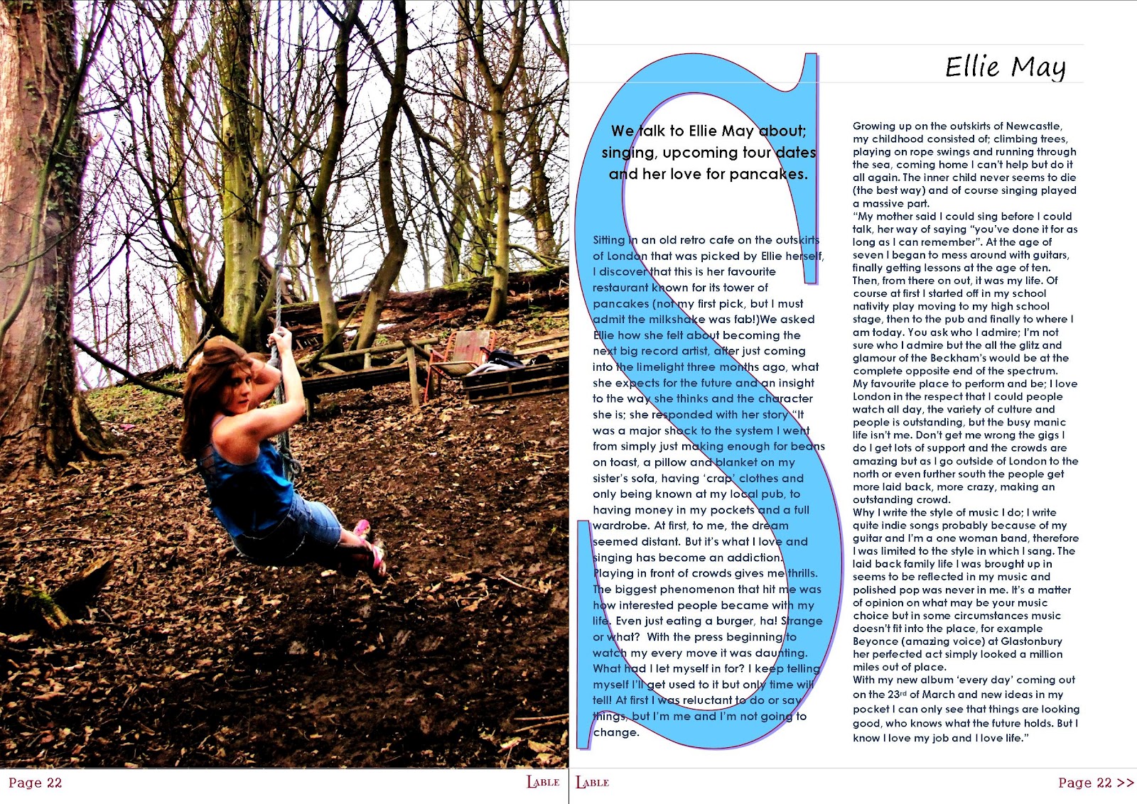
My media product represents the audience that the magazine is designed for this being; 16-25 yr olds both male and female but specifically female. It does this by the specific conventions of the magazine for example the photograph on the front is not stereotypically the same as other magazines, it is not as perfectly edited giving a false body image- this then represents the audience as ‘indie’ is not about glamorization of photos its more about the laid back sense of personality – creating a positive representation of woman. There is also no colours used on the front cover that directly points to a specific gender as the colour of her dress is blue (blue being stereotypically ‘boyish’ but then when mixed in with a dress – evens out the gender issues) The colour of the title is also neutral although it may sway towards a more girls colour it is not an obvious difference. In my article I have written it in a casual manner as if Ellie herself is saying it, by her also talking about how she loves to eat pancakes, play on rope swings and go in the sea makes her seem the complete opposite to a typical ‘perfect woman’ image which means it portrays woman in a better light to the audience and they will not feel as intimidated by the perfection of the fake models and therefore will enjoy the magazine more. Therefore my magazine represents the fun ‘normal’ woman who enjoys everyday life- which is similar to the audience that will be reading the magazine.
·What kind of media institution might distribute your media product and why?
The media institution that may distribute my magazine is Bauer media I think that they would publish my magazine as it is different to some of the magazines that they already sell, this would also be a positive because there would be no competition with other magazines to buy mine meaning more profits. Although there are other music magazines for example Q this is a positive as it is a up market high branded music magazine that is very popular although Q would be a slight competition it targets a different audience therefore it would only slightly affect the sales, by my magazine also being to a different audience I think that the institution would use my magazine as it would bring a wider audience to the websites advertising them and bringing them more publicity and money therefore benefitting them.
·Who would be the audience for your media product?
The audience that I have chosen for my media product is for both male and female but is designed more towards a female audience, the age range for the magazine is between the ages 16 to 25 this is because of the conventions of my music magazine for example the article would not suit an older audience as it does not use the language and storyline that would be appropriate for this age group and they would lose interest as well as it not being suitable for the older age group it is also unsuitable for a younger age group as the article uses more intellectual words that they may not be able to understand some of the pictures are also perhaps too sticking and inappropriate (perhaps more revealing to a younger audience. The younger audience will also enjoy the magazine as it is on a level with them the artists who are featured in the magazine are also designed for this age range their music targets this audience and therefore because the bands that suit the audience are in the magazine they will then therefore buy it. The features in the magazine for example things about festival tickets also appeals to this age range as at the age of 16 people will begin going to festivals and often stop at around the age of 25 on average and therefore will be interested in the magazine more as events that they like to attend are also in this.
·How did you attract/address your audience?
I have attracted my audience instantly by using striking photographs on the front of the magazine as without these the magazine would not be noticed on the shelf and therefore would not sell, I used a model of a similar age range to the audience so that the audience is able to relate immediately to what she is wearing and subconsciously think of it for themselves. By then have interesting cover lines like ’Have you got your wellies?’ makes the audience curios to what it means and what the answer could be as it does not really suggest anything and therefore they will be inclined to pick the magazine up and read it. I have then used sepia style images on the contents page to make them seem authentic and different suiting the type of photography and style the audience like, also by editing the photos the pictures become more obvious to the eye and are drawn in and therefore will buy the probuct.
·What have you learnt about technologies from the process of constructing this product?
Since the construction of this product I have learnt a lot about different media types. I first learnt which publication would be best to produce my magazine on and what would be the best tools to do so for example; on publisher I learnt how to use the white pen – this is when you click on the white parts of you pictures it deletes them, this became very useful when making my front cover and deleting the background to my front cover image so that text would contrast better on top. I also learnt how to send texts behind others so that it all fits together. When editing my photographs I used Photoshop to change the lighting and contrast to make the photos look of a higher quality and professional, i also learnt how to cut around the edge of photographs to get rid of any unwanted backgrounds that would be unconventional and inappropriate for the magazine by fully magnifying the photograph it also allowed you to cut around the photo precisely to stop any parts of the photograph being cut out. I have also learnt about the different types of font make a large difference on the magazine as a sans serif was inappropriate for my models name as the fonts often looked to printed or ‘gaudy’ but a serif font gave a relaxed tone to the name and fitted in well with the genre. I have also learned that by using the ruler guide at the top of the screen to keep everything inline the piece looks better and looked more like a professional magazine rather than box’s being slightly of centre.
·Looking back at your preliminary task, what do you feel you have learnt in the progression from it to the full product?
Front cover; To begin my front cover I analysed other music magazines to find out what the important conventions of this were, I found that the masthead was mainly centred at the top of the page, I also found that there were always at least 5 cover lines on each front cover. It also came to my attention that it was very rare for the picture on the front cover for the eyes of the model not to be looking directly at the front cover. The colour scheme of the magazine also usually linked in with the model whether it was what they wore or there make-up. I also found that apart from the magazine Kerrang the other style models I studied all had whit backgrounds – I preferred this as it was not to over the top it also fit in better with the genre of my magazine, this was also popular with my audience feedback. I then began to interpret these conventions into my own work; I used a picture of my model looking directly into the camera so that wherever the audience stands it looks like she is looking at them making it seem like the magazine is engaging with them, I choose for my model to were a plain coloured dress so that the colour schemes of the magazine was not too hard to match and did not look out of synch. I matched the masthead colour to her lipstick so that it looked like there was a connection and nothing looked out of place. The masthead name of the title was very conventional as the name ‘Label’ fitted in well with the idea of record label linking in well with the idea of a music magazine. The font style in which a I choose to use was @gushung, this looked like a strong print (sans serif) which was clear and easy to read which went well as at glance it would be easy to see what the text said without having to look at it carefully which would seem a lot of effort to the reader and put them of buying or reading the product. I then used the obvious conventions of a magazine for example; bar codes and prices this made my piece look more realistic. I challenged the conventions of a music magazine by using a younger model as most models often look a lot older but I think the image works well with the piece and her ‘look’ fits in well.
Contents Page; Again I analysed some style models of contents pages some were double age spreads and some were single page spreads, I personally preferred double page spreads as well as my audience as the information was more spread out and was easier to read it also meant that photos could be added in making it seem more appealing, although both are conventional to a music magazine the double page spread seems to be more preferred therefore I choose to use it. The typical conventions of a contents page in a music magazine that I discovered were; the higher the importance’s of the piece the more it stood out, also things were often in columns. The magazine Q challenged this slightly by have more pictures and less of an ordered style but I think this suited the genre of my magazine more and therefore interpreted it into my own work, the fact I was able to use larger and more pictures also made the magazine look more interesting giving a positive easy image for the rest of the magazine – an enjoyable experience. Another convention I noticed and decided to use was that of a screen shot of certain pages so that when the reader was flicking through the magazine they knew instantly what they were looking for again meeting audiences’ subconscious expectations. Another convention I stuck to was the running theme of font sizes, colours and fonts therefore it looked consistent and professional as it links all of the ideas of the magazine together and not as if the audience had just swapped magazines, making the magazine seem muddled and messy. By also breaking up the information into the box’s it made it very simple for the reader to distinguish different information making it again easier to read. I then again at the top of the page used the magazines logo to constantly promote it and remind readers what they are reading, in another aspect of promoting the name and making the magazine look conventional i have left a gap at the bottom of each page (equally measured) so that a age number and name can go in this space making the magazine look realistic – like a magazine. Also like in a alot of the magazines I studied each had a editors letter on the contents page making it seem like it was personal to the reader as if an extra effort has been put into the magazine making the audience feel more appreciated, therefore I put one into my own work, this was the only piece on the contents were i changed the font of the writing - i changed it into sans serif to make the writing look hand written as if even more time was put into it and it was not just a mass produced piece.
Double page spread;
Again I studied many different double page spreads with all often similar conventions for example; The writing was always in columns (as this makes it easier for the reader to read - it seems like the task of reading it is not as big as it seems, making them more inclined to read the article) A small part of the text often a quote was often in a larger font this draws the reader in again making the text look easier to read and then once the reader is hooked it goes into the full article and they then read the rest. On the majority of the style models the pictures were on the left hand side, often only using only one large picture to add effect and detail, making the photo seem more striking by it reaching the ends of the page, but some used smaller photos on top of the larger ones to give audience more information, I choose not to do this as I think it ruined the effect of the photo. Another convention used was a large drop caps at the start of the paragraph it is a presentational devise (graphologically it looks more presentable and conventional) this is almost always used in magazines. In my magazine I choose to use similar ideas to in the magazine of Q by have a large letter behind the writing this prevents the page with the article on looking bare and unattractive this then means the audience is attracted to the page more. Similarly to the contents page I used the separators along the bottom of the page to put the page numbers and label logo in to have a consistent professional theme. I found the conventions of a double page spread a lot less than those of both the contents and font cover as I think once you have got the picture correct the writing easily falls into place, I also choose to have the font in a 11 or 12 this made it look small and therefore perhaps more adult friendly rather than children’s novel.
·How does your media product represent particular social groups?
My media product represents the audience that the magazine is designed for this being; 16-25 yr olds both male and female but specifically female. It does this by the specific conventions of the magazine for example the photograph on the front is not stereotypically the same as other magazines, it is not as perfectly edited giving a false body image- this then represents the audience as ‘indie’ is not about glamorization of photos its more about the laid back sense of personality – creating a positive representation of woman. There is also no colours used on the front cover that directly points to a specific gender as the colour of her dress is blue (blue being stereotypically ‘boyish’ but then when mixed in with a dress – evens out the gender issues) The colour of the title is also neutral although it may sway towards a more girls colour it is not an obvious difference. In my article I have written it in a casual manner as if Ellie herself is saying it, by her also talking about how she loves to eat pancakes, play on rope swings and go in the sea makes her seem the complete opposite to a typical ‘perfect woman’ image which means it portrays woman in a better light to the audience and they will not feel as intimidated by the perfection of the fake models and therefore will enjoy the magazine more. Therefore my magazine represents the fun ‘normal’ woman who enjoys everyday life- which is similar to the audience that will be reading the magazine.
·What kind of media institution might distribute your media product and why?
The media institution that may distribute my magazine is Bauer media I think that they would publish my magazine as it is different to some of the magazines that they already sell, this would also be a positive because there would be no competition with other magazines to buy mine meaning more profits. Although there are other music magazines for example Q this is a positive as it is a up market high branded music magazine that is very popular although Q would be a slight competition it targets a different audience therefore it would only slightly affect the sales, by my magazine also being to a different audience I think that the institution would use my magazine as it would bring a wider audience to the websites advertising them and bringing them more publicity and money therefore benefitting them.
·Who would be the audience for your media product?
The audience that I have chosen for my media product is for both male and female but is designed more towards a female audience, the age range for the magazine is between the ages 16 to 25 this is because of the conventions of my music magazine for example the article would not suit an older audience as it does not use the language and storyline that would be appropriate for this age group and they would lose interest as well as it not being suitable for the older age group it is also unsuitable for a younger age group as the article uses more intellectual words that they may not be able to understand some of the pictures are also perhaps too sticking and inappropriate (perhaps more revealing to a younger audience. The younger audience will also enjoy the magazine as it is on a level with them the artists who are featured in the magazine are also designed for this age range their music targets this audience and therefore because the bands that suit the audience are in the magazine they will then therefore buy it. The features in the magazine for example things about festival tickets also appeals to this age range as at the age of 16 people will begin going to festivals and often stop at around the age of 25 on average and therefore will be interested in the magazine more as events that they like to attend are also in this.
·How did you attract/address your audience?
I have attracted my audience instantly by using striking photographs on the front of the magazine as without these the magazine would not be noticed on the shelf and therefore would not sell, I used a model of a similar age range to the audience so that the audience is able to relate immediately to what she is wearing and subconsciously think of it for themselves. By then have interesting cover lines like ’Have you got your wellies?’ makes the audience curios to what it means and what the answer could be as it does not really suggest anything and therefore they will be inclined to pick the magazine up and read it. I have then used sepia style images on the contents page to make them seem authentic and different suiting the type of photography and style the audience like, also by editing the photos the pictures become more obvious to the eye and are drawn in and therefore will buy the probuct.
·What have you learnt about technologies from the process of constructing this product?
Since the construction of this product I have learnt a lot about different media types. I first learnt which publication would be best to produce my magazine on and what would be the best tools to do so for example; on publisher I learnt how to use the white pen – this is when you click on the white parts of you pictures it deletes them, this became very useful when making my front cover and deleting the background to my front cover image so that text would contrast better on top. I also learnt how to send texts behind others so that it all fits together. When editing my photographs I used Photoshop to change the lighting and contrast to make the photos look of a higher quality and professional, i also learnt how to cut around the edge of photographs to get rid of any unwanted backgrounds that would be unconventional and inappropriate for the magazine by fully magnifying the photograph it also allowed you to cut around the photo precisely to stop any parts of the photograph being cut out. I have also learnt about the different types of font make a large difference on the magazine as a sans serif was inappropriate for my models name as the fonts often looked to printed or ‘gaudy’ but a serif font gave a relaxed tone to the name and fitted in well with the genre. I have also learned that by using the ruler guide at the top of the screen to keep everything inline the piece looks better and looked more like a professional magazine rather than box’s being slightly of centre.
·Looking back at your preliminary task, what do you feel you have learnt in the progression from it to the full product?
Since my preliminary task I have learnt how to make a full magazine, and that you need to research into what your audience wants in the magazine, I have also learnt all of the magazine conventions that go into the magazine. As shown in my preliminary task i did not know how to target my audience I also was unable to understand why the layout was incorrect due to fonts and colour for example i did no questioner’s therefore just had to assume what colour background the audience would have preferred. I have also learnt that you cannot put similar colours on top of each other as the audience is unable to see it clearly and therefore the product does not look as good and as if it is not a professional magazine. I have also learnt that some of the shapes you can use on publisher are inappropriate for conventions on the front of the magazine as they look ‘cheep, childish and naff’. I have also learnt about what language to use on the front cover i.e. short snappy headlines that draw the reader in as well as even rhetorical questions to make the reader want to look inside the magazine. The photo on the front cover also has to be striking and enticing with the eyes looking at the camera so that the model both engages with the audience and also stands out on the shelf next to other magazines, the clothing that the model wears is also very important as a dim colour may blend into the background and make the photo look too striking, but yet a largely patterned outfit may look over the top making the magazine look messy and unordered. I have also learnt that the colours on the front cover must match something with the artist to link everything together this should also be a running theme throughout the whole magazine so that it looks all part of one magazine.


.jpg)


