Monday, 19 March 2012


.jpg)


Making my front cover

I began making my front cover with a range of ictures to see which one looked better as a magazine and which was most conventional to a music magazing. I choose numerouse headlines to put on the front cover


Article
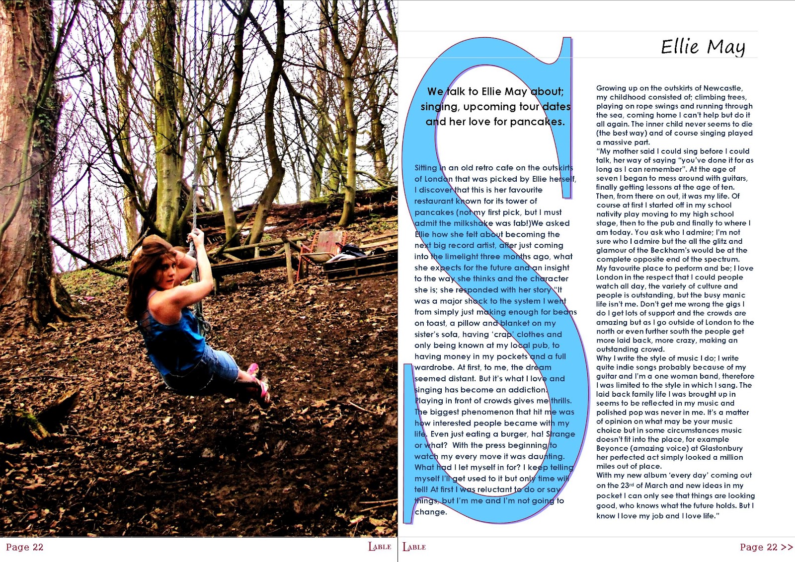
This is my final article that will go into my final piece.
I have choosen to write my piece as an interview as it was th most popular choice from my questionares it is also the most popular genre for a music magazine.
I have written in the style in which I think my target audience would prefere; laid back language and an informal tone, but yet using harder language in parts so that the audience does not become uninterested and find the article patronising and child like. I wrote the article in a way that it sounds very convosational and the audience is able to get into the article (drawn in) and imagine Ellie May herself saying this.
I have choosen to write my piece as an interview as it was th most popular choice from my questionares it is also the most popular genre for a music magazine.
I have written in the style in which I think my target audience would prefere; laid back language and an informal tone, but yet using harder language in parts so that the audience does not become uninterested and find the article patronising and child like. I wrote the article in a way that it sounds very convosational and the audience is able to get into the article (drawn in) and imagine Ellie May herself saying this.
We talk to Ellie May about; singing, upcoming tour dates and her love for pancakes.
Sitting in an old retro cafe on the outskirts of London that was picked by Ellie herself, I discover that this is her favourite restaurant known for its tower of pancakes (not my first pick, but I must admit the milkshake was fab!)We asked Ellie how she felt about becoming the next big record artist, after just coming into the limelight three months ago, what she expects for the future and an insight to the way she thinks and the character she is; she responded with her story “It was a major shock to the system I went from simply just making enough for beans on toast, a pillow and blanket on my sister’s sofa, having ‘crap’ clothes and only being known at my local pub, to having money in my pockets and a full wardrobe. At first, to me, the dream seemed distant. But it’s what I love and singing has become an addiction. Playing in front of crowds gives me thrills. The biggest phenomenon that hit me was how interested people became with my life. Even just eating a burger, ha! Strange or what? With the press beginning to watch my every move it was daunting. What had I let myself in for? I keep telling myself I’ll get used to it but only time will tell! At first I was reluctant to do or say things, but I’m me and I’m not going to change.
Growing up on the outskirts of Newcastle, my childhood consisted of; climbing trees, playing on rope swings and running through the sea, coming home I can’t help but do it all again. The inner child never seems to die (the best way) and of course singing played a massive part.
“My mother said I could sing before I could talk, her way of saying “you’ve done it for as long as I can remember”. At the age of seven I began to mess around with guitars, finally getting lessons at the age of ten. Then, from there on out, it was my life. Of course at first I started off in my school nativity play moving to my high school stage, then to the pub and finally to where I am today. You ask who I admire; I’m not sure who I admire but the all the glitz and glamour of the Beckham’s would be at the complete opposite end of the spectrum.
My favourite place to perform and be; I love London in the respect that I could people watch all day, the variety of culture and people is outstanding, but the busy manic life isn’t me. Don’t get me wrong the gigs I do I get lots of support and the crowds are amazing but as I go outside of London to the north or even further south the people get more laid back, more crazy, making an outstanding crowd.
Why I write the style of music I do; I write quite indie songs probably because of my guitar and I’m a one woman band, therefore I was limited to the style in which I sang. The laid back family life I was brought up in seems to be reflected in my music and polished pop was never in me. It’s a matter of opinion on what may be your music choice but in some circumstances music doesn’t fit into the place, for example Beyonce (amazing voice) at Glastonbury her perfected act simply looked a million miles out of place.
With my new album ‘every day’ coming out on the 23rd of March and new ideas in my pocket I can only see that things are looking good, who knows what the future holds. But I know I love my job and I love life.”
Friday, 16 March 2012
Photos contents
These are some of the photos I used for my contents page and ones that I was unable to choose between.
 I took this photo in the centre of Newcastle in a busy street, I choose to do this because my magazine is an indie magazine and the audience it is aimed at is for perhaps a more laid back (stereotypically 'hippie') type and therefor the idea of a singer starting out busking on the streets to what they have become today intereges the audience it is aimed at. By the person in the photo not loking all made up also adds to the image of what my targeted audience likes. I changed the contrast of the phtoto to make the photo seem clearer to the eye and stand out, it also fits in with the colours of the other photos as all of the photos on the contents page are either in sepia or high contrast so they all have a similar look. By editing the photo it also make the photo look of a better quality and as if it has been specificall done for the magazine.

 I choose to take this photo of a model in fancy dress as i thought it would give the magazine an intersting twists and therefor intregue the reader making them wounder what its assosiated with. I changed the contrast, colour and lighting i also added highlights to the picture i used photoshop to do this i did it because i think it gave the picture a cartoon look and minnie mouse was originally a cartoon and therefor they work well in my contents. I choose not to cut out the background as the american style bar in the background looked intreging and a bit differant to the reader making them want to read the article to see what the picture represents. Again the veiws from my choosen audience prefered pictures like this as they do not look as 'fake' and 'glamorous' and therefor fits in with the magazine genre and suits the targeted audience. Feedback from my audience was that they liked the idea of haveing the model in fancy dress as it would intergue them to what the article is about encouraging them to buy the magazine.
 I particlarly choose this picture because again similarly to the one above this the cartoon effect gives a high quality image that targets it's audience, the contrast in colours of the bright green drink and red dress also gives a starterling effect. The red in the picture is oftern also potrayed a dangerouse or love aswell as having the top of her leg showing gives the audience a specific idea in their head this then highly contrasts with the friendly inocence of minnie mouse and therefor seems mysteriose entising the audeiecne to read it. By her also un convetioanly not looking at the camera it again gives the audience a sence of mystery.


I again took this photo in newcastle as i think the photo looks more natural and laid back and as from feed back from my targeted audience they said that they preferred this types of photos. I gradually edited this photo changing the colour, contrast and lighting the first time i editied the photo it was to change the colour outlines of the colours in the picture so that it didnt blend in with the rest of the picture the contrast was higher and therefor stood out to the eye more appealing to the audiences interests more. I then decided to put the picture in negative and use it as a smaller picture as i thought it looked like an albumn cover which would fit in with the music magazine genre, it also highlights the guatare which shows the reader instantly what the article ect is going to be about. The picture again after being editited looks more professional and of a higher qualty looking professional, (by it being in an old style theme it fits in with the indie magazine). I choose to do a longer shot so that the audience is able to see the aritists full body a guatare which has the full effect. The feedback i also had from when the magazine was put together was that of the style of the edited pictures, they were also prefered as the phtots look natural and unstaged.

 I particlarly choose this picture because again similarly to the one above this the cartoon effect gives a high quality image that targets it's audience, the contrast in colours of the bright green drink and red dress also gives a starterling effect. The red in the picture is oftern also potrayed a dangerouse or love aswell as having the top of her leg showing gives the audience a specific idea in their head this then highly contrasts with the friendly inocence of minnie mouse and therefor seems mysteriose entising the audeiecne to read it. By her also un convetioanly not looking at the camera it again gives the audience a sence of mystery.
I took this picture against a collaged 'surfing themed' wall which comes with the idea of it being laid back and therefor fits in with the relaxed theme of the indie style magazine. (my audience agreed that this was a good picture and were intregeed by the backgrond) I changed the contrast of the picture to make it stand out more for example the dress looks a brighter blue ( bright blue also assosiated with being 'cool') and fits in well with the style of the background (the sea blues and also the idea that surfing theme is laid back like the magazine, the collage also looks like the photo has been took against a professional background.) it has also gave the model a glowing skin tone making her look prettier and stereotypically what people want to see in music magazine pictures. The natural make up also make the picture seem not to over the top. I choose to do a mid shot as it is oon the contents page and a long shot would be hard to see at it is a smaller icture and i also wanted to give the audience a taster of the models personality and clothing choices as well as seeing her facial expresions.
Subscribe to:
Posts (Atom)